Orbit Float v2
Accessibility, Branding
Orbit Float — Rebrand & Accessible Web Redesign
Refining a premium wellness brand into a more confident, accessible, and conversion-ready experience.
Final Results
Sales Lift
estimated +5 pods/mo + increase in bookings
#Wellness
#E-Commerce
#Re-Branding
#WordPress
#Accessibility
Timeline: 1 month
Platform: Figma → WordPress (E-Commerce)
Role: Designer
Project Overview
Goal
Take Orbit Float from a solid v1 brand to a confidently premium one — and rebuild the site to convert better, feel more refined, and meet WCAG 2.1 AA accessibility standards across the board.
Challenge
The original site did its job — it launched a business, established a brand presence, and started selling pods. But after months of real-world traffic, the cracks showed: the design felt good, not premium. Conversion was flat. And accessibility had been a baseline consideration, not a priority. The brief was to fix all three at once, in a single month.
Outcome
A more mature brand identity, a redesigned site engineered for both conversions and accessibility, and a foundation that lets Orbit Float compete with the most premium wellness brands in the UK — without leaving any user behind.
Introduction
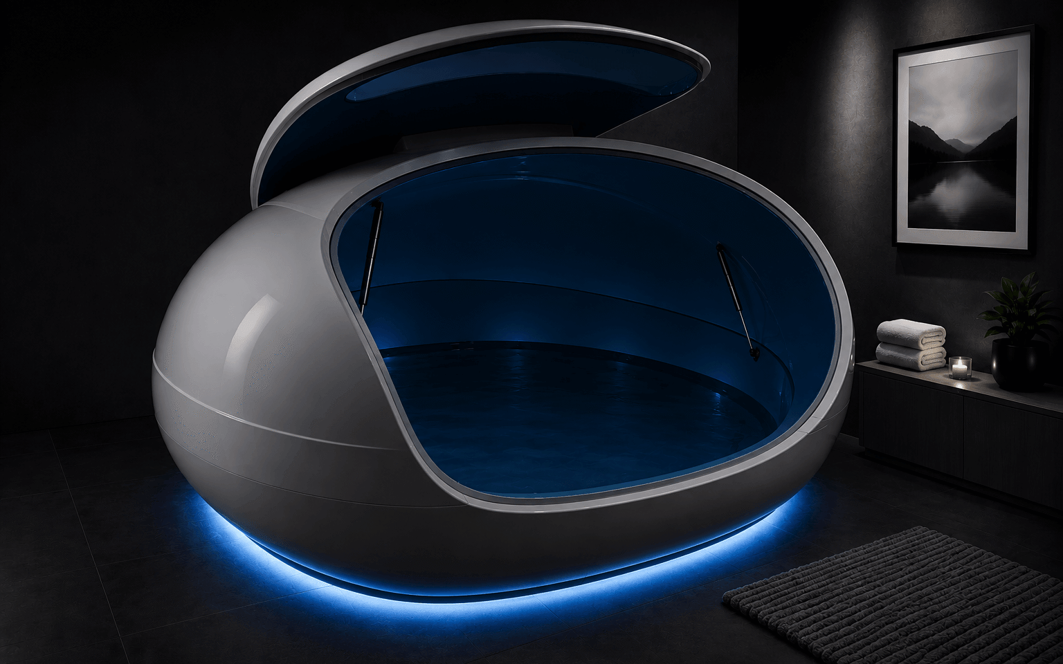
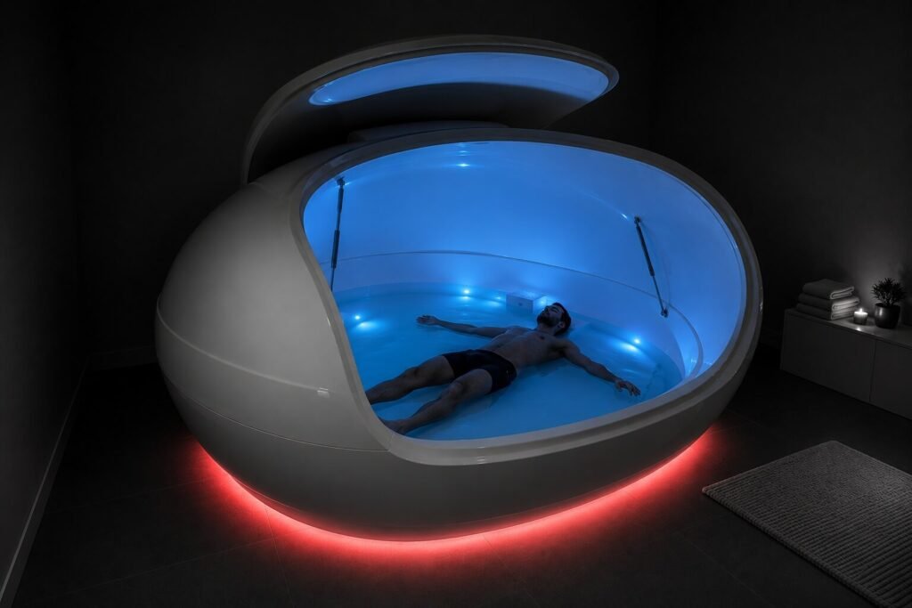
Orbit Float is a UK-based premium floatation tank manufacturer offering one of the most advanced sensory deprivation experiences on the market. Their pods reduce all external stimuli — sight, sound, tactile sensation, and gravity — using water heated to skin temperature, Epsom salt buoyancy, and a fully isolated chamber to create complete weightlessness. Built around 100% solution processing and an advanced filtration system, each pod is engineered for crystal-clean floats whether installed in a private home or running back-to-back sessions in a commercial spa. After the initial brand and site launch, Orbit Float had a real digital footprint, real customers, and real sales data — but they’d outgrown the original presentation. The market was sharpening, expectations were rising, and the brand needed to move with it. This second phase wasn’t a rebuild from scratch; it was a refinement — taking what was working, sharpening what wasn’t, and adding accessibility as a non-negotiable foundation.
My Role
I led design end-to-end as the sole designer — brand evolution, UX, UI, accessibility, and developer handoff. All design work was completed in a single month.
Scope of Work
Audit → Brand Refresh → Accessibility Strategy → Wireframes → UI Design → Design System → Handoff
Every phase was applied within a tight 1 month timeline.
Discovery
The Problem
The first version of Orbit Float succeeded at building a brand from nothing. The second version had to address what nothing-to-something doesn’t catch: nuance, polish, accessibility, and conversion friction. Four problems shaped the rebrand.

Problem #1
The brand looked good, but not premium
The original identity was clean and competent – but it didn’t yet hold its own against established wellness brands. Color, typography, and photography were doing their job but not telling a story strong enough to justify a five-figure purchase.
EXAMPLE: Side by side with high-end wellness competitors, Orbit Float read as a quality product rather than a category-defining one.
IMPACT: Limited the brand’s ability to command premium pricing and attract the highest-tier buyers – affluent homeowners and design-led wellness operators.
Problem #2
Conversion was leaking across the funnel
The original site worked, but real user behavior revealed friction points — buyers were hesitating at the product page, drop-off was high in the checkout flow, and booking inquiries weren’t converting at the rate the traffic suggested they should.
EXAMPLE: Visitors spending 3+ minutes on the product page were still not initiating checkout or booking a consultation — a clear signal that something wasn’t closing the deal.
IMPACT: Lost revenue on warm traffic that was already past the awareness stage.
Problem #3
Accessibility was an afterthought, not a foundation
The v1 site was built fast and built well — but accessibility had been a “we’ll check it later” item. Color contrast, keyboard navigation, focus states, alt text, form labeling, and motion handling were inconsistent. For a premium UK brand serving customers across a wide demographic — including older buyers, customers with disabilities, and wellness operators with accessibility obligations of their own — this was a real gap.
EXAMPLE: A buyer using a screen reader couldn’t navigate the product configurator without confusion. A user with low vision struggled to read body copy against the lighter background tints.
IMPACT: Excluded a meaningful portion of potential customers, and exposed Orbit Float to risk under the UK Equality Act 2010 and broader WCAG expectations.
Problem #4
Inconsistency between sales and bookings
Orbit Float sells two things: pods (product sales) and float sessions (bookings, through partner centers and direct). The original site treated these as one funnel — but they’re fundamentally different decisions for different users. Mixing them blurred the message.
EXAMPLE: A first-time visitor curious about trying floating got pushed toward purchase-led content. A serious B2B buyer got distracted by session-booking CTAs.
IMPACT: Both audiences left less converted than they should have been.
Defining the problem
The first site built the business. The second site had to scale it — premium, accessible, and built to convert two distinct audiences without compromise.
Goals
BUSINESS GOALS
Increase pod sales
Sharpen the path from product page to purchase. Reduce drop-off, build trust faster, and present pricing with confidence rather than hesitation.
Increase float bookings
Build a dedicated, frictionless booking experience for users looking to try floating — separating it from the pod-purchase funnel so neither audience gets diluted.
Position as the premium UK choice
Refine every visual decision — logo, color, type, photography, tone — to signal category leadership rather than competence.
USER GOALS
Make the product feel trustworthy and worth the investment
Give serious buyers enough confidence in the product, the brand, and the experience to commit to a high-ticket purchase or a booked session.
Make the site usable for everyone
Meet WCAG 2.1 AA across navigation, color, typography, forms, and interactive components — so the site works equally well for users with low vision, motor impairments, screen readers, or assistive technology.
Our Users
The second phase refined the user picture based on real customer data from the launch period. Three distinct archetypes emerged.
The Home Wellness Buyer
Affluent UK homeowners investing in long-term wellness, recovery, and home design. They’ve often floated before and want the experience permanently in their lives. Design-conscious, value privacy and aesthetics, and expect a brand that matches the quality of the rest of their home.
JOBS-TO-BE-DONE: When I invest in my home wellness space, I want a floatation tank that feels as premium as the rest of my home, so I can recover and reset without compromise.
The Spa & Wellness Operator
Owners of spas, wellness studios, recovery centers, and high-end hotels adding floatation as a service. They need reliability, hygiene credentials, commercial-grade durability, and a supplier brand that elevates their own offering.
JOBS-TO-BE-DONE: When I expand my wellness offering, I want a floatation partner that signals quality to my own clients, so I can charge premium rates and build my reputation.
The First-Time Floater
Curious individuals — often referred by friends, found through social, or researching wellness — who want to try floating before considering anything bigger. They’re not buying a pod. They want to book a session at a nearby center and understand what they’re walking into.
JOBS-TO-BE-DONE: When I’m curious about floating, I want a clear way to find a session near me and know what to expect, so I can try it without confusion or anxiety.
Process
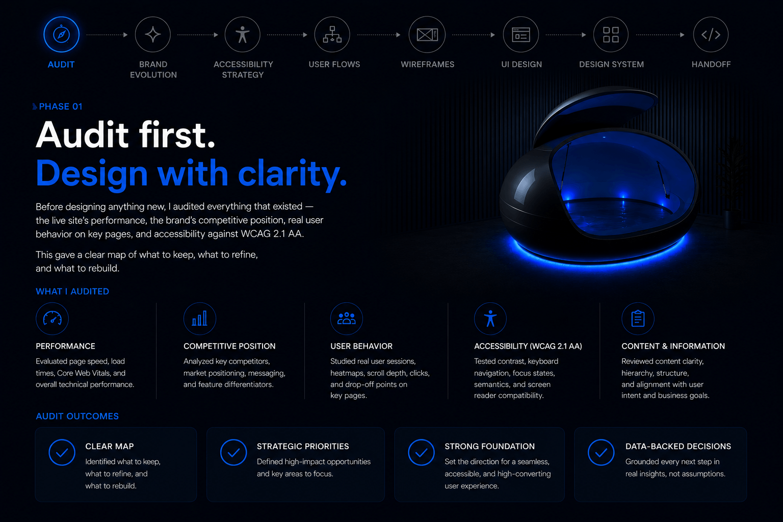
Audit
Before designing anything new, I audited everything that existed — the live site’s performance, the brand’s competitive position, real user behavior on key pages, and accessibility against WCAG 2.1 AA. This gave a clear map of what to keep, what to refine, and what to rebuild.
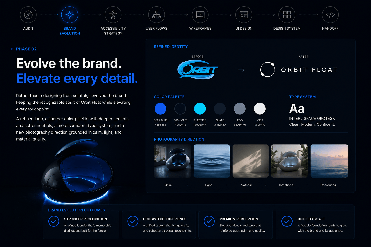
Brand Evolution
Rather than redesigning from scratch, I evolved the brand — keeping the recognizable spirit of Orbit Float while elevating every touchpoint. A refined logo, a sharper color palette with deeper accents and softer neutrals, a more confident type system, and a new photography direction grounded in calm, light, and material quality.
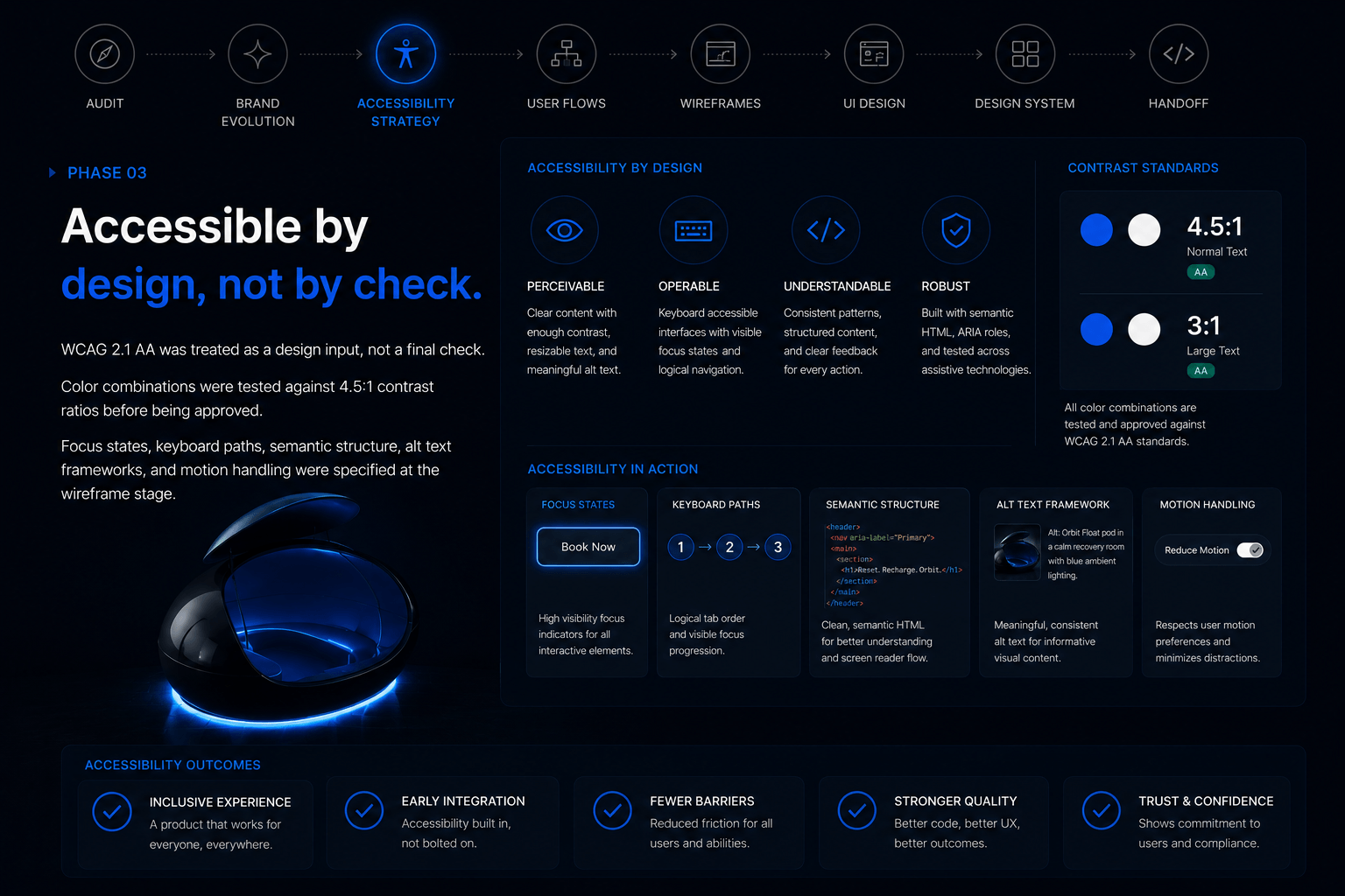
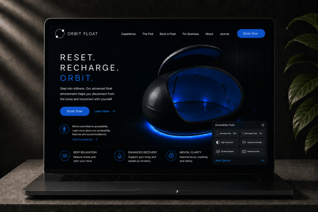
Accessibility Strategy
WCAG 2.1 AA was treated as a design input, not a final check. Color combinations were tested against 4.5:1 contrast ratios before being approved. Focus states, keyboard paths, semantic structure, alt text frameworks, and motion handling were specified at the wireframe stage.
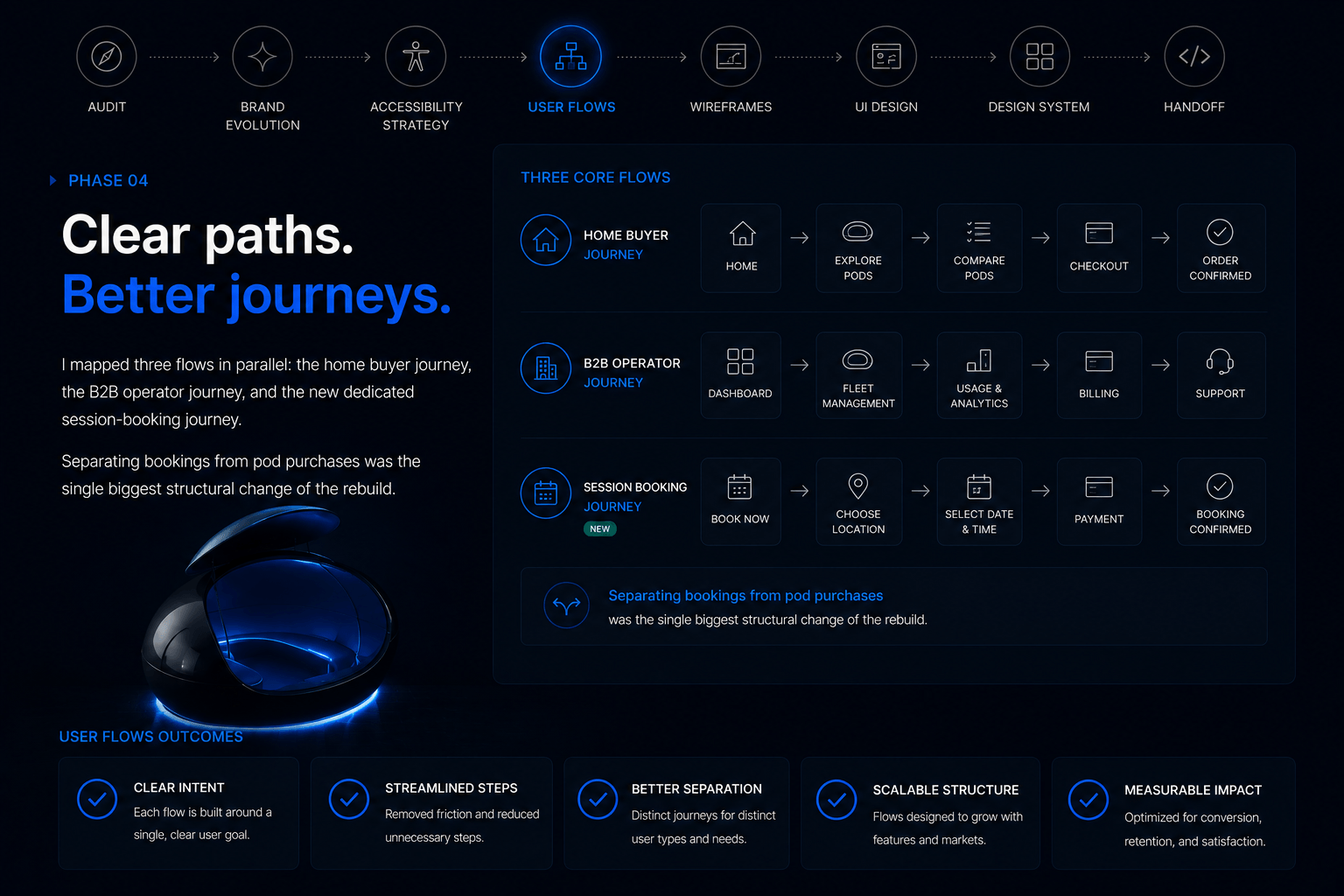
User Flows
I mapped three flows in parallel: the home buyer journey, the B2B operator journey, and the new dedicated session-booking journey. Separating bookings from pod purchases was the single biggest structural change of the rebuild.
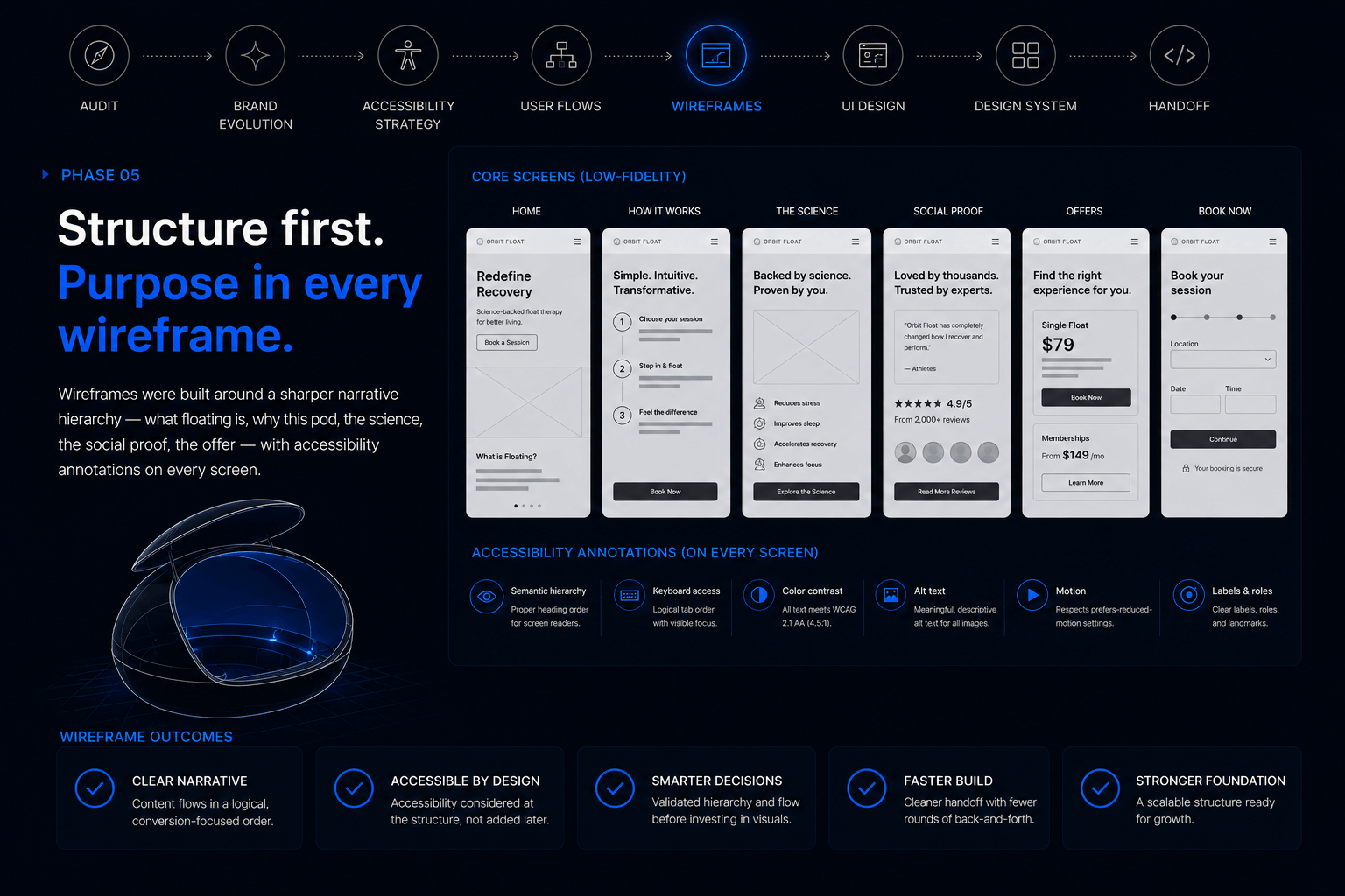
Wireframes
Wireframes were built around a sharper narrative hierarchy — what floating is, why this pod, the science, the social proof, the offer — with accessibility annotations on every screen.
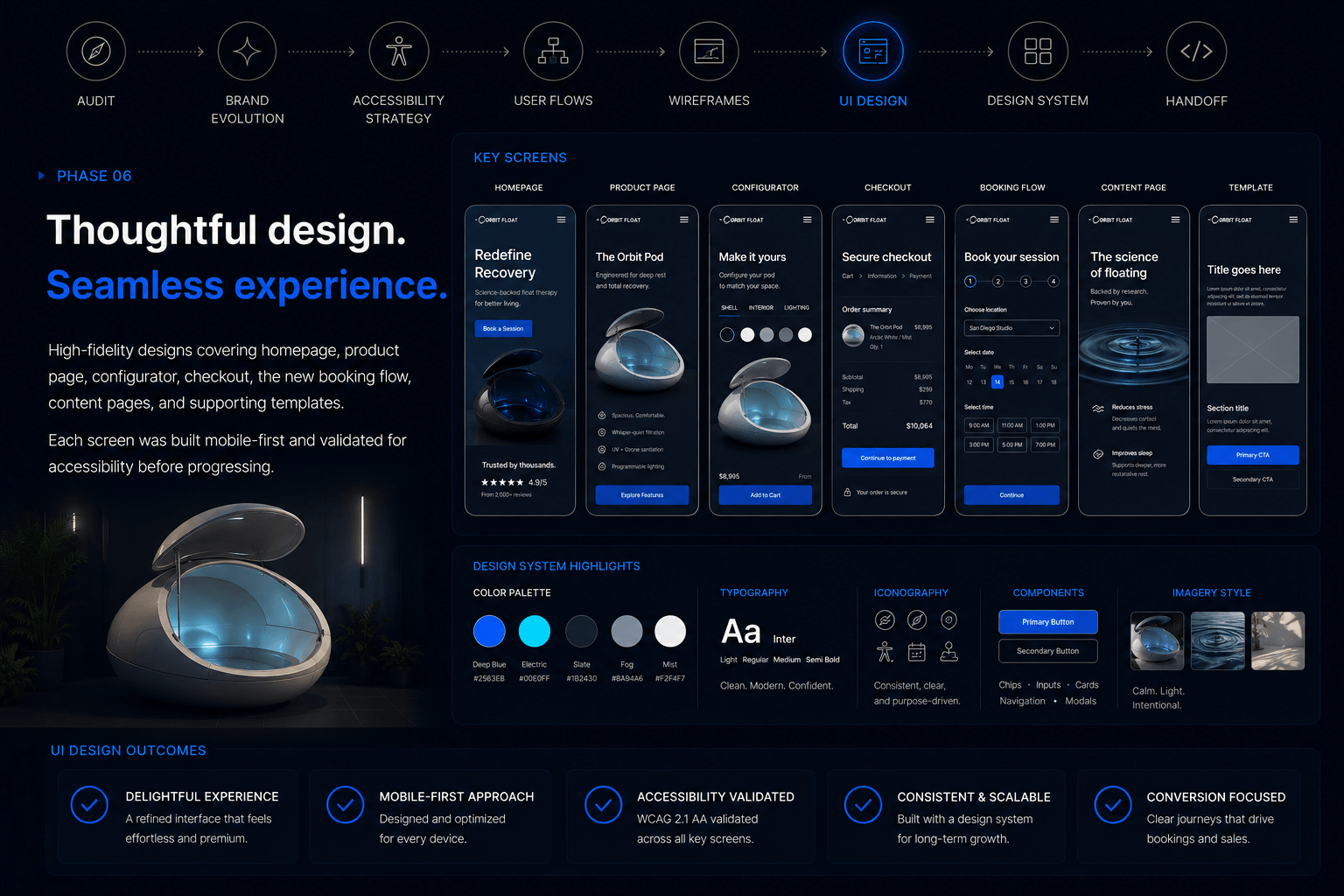
UI Design
High-fidelity designs covering homepage, product page, configurator, checkout, the new booking flow, content pages, and supporting templates. Each screen was built mobile-first and validated for accessibility before progressing.
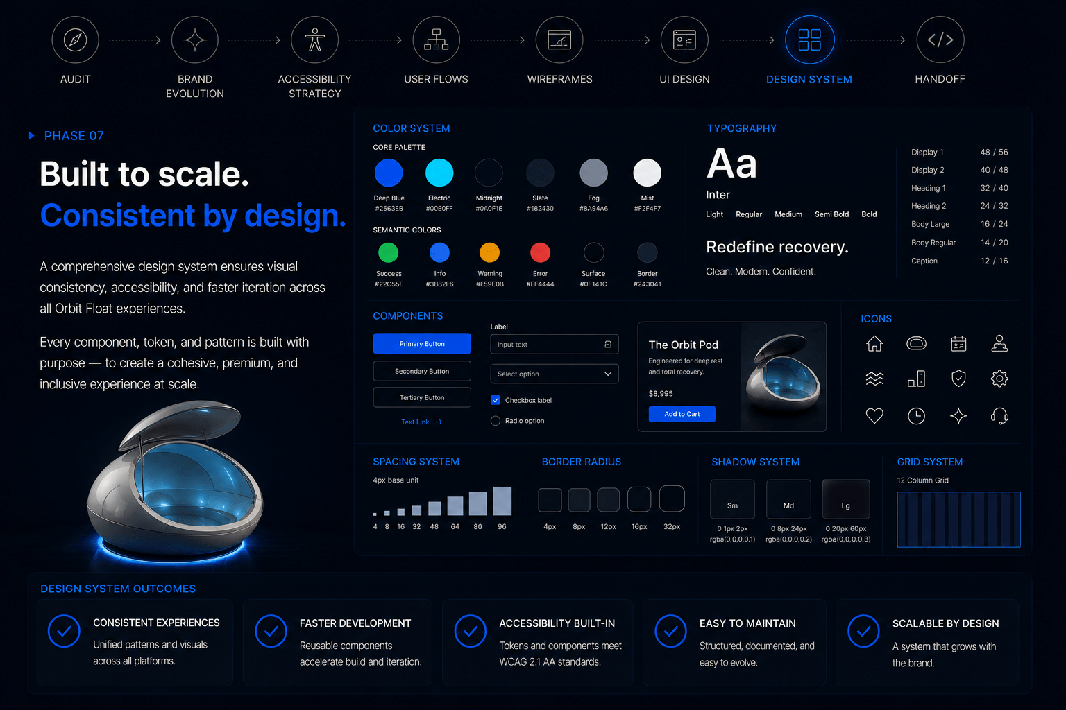
Design System
A refreshed design system with documented components, accessible color tokens, typography scale, focus state specs, and motion guidelines — built for both designers and developers to extend without breaking accessibility.
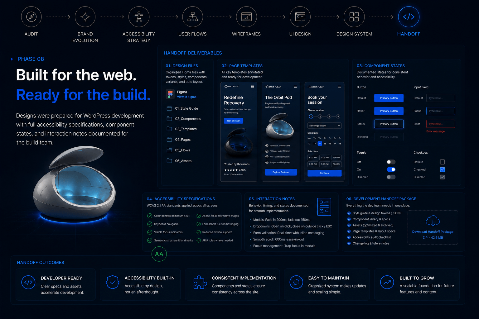
Handoff
Designs were prepared for WordPress development with full accessibility specifications, component states, and interaction notes documented for the build team.
Accessibility — Built In, Not Bolted On
Accessibility was treated as a first-class design constraint from day one, not a compliance pass at the end. Key decisions:
- Color & contrast — every text and interactive element validated against WCAG 2.1 AA contrast ratios (4.5:1 for body, 3:1 for large text and UI). Brand accents were adjusted at the palette stage to ensure no compliant combination required workarounds.
- Typography — sized for readability on all devices, with clear hierarchy and generous line-height. No body copy below 16px.
- Focus states — every interactive element has a visible, branded focus indicator with sufficient contrast against any background it sits on.
- Keyboard navigation — full keyboard paths for every flow including the configurator and booking experience, with logical tab order and skip-to-content links.
- Semantic structure — proper heading hierarchy, landmark regions, and ARIA labels specified in the handoff for the development team.
- Forms — labeled inputs, descriptive error messages, and accessible validation patterns across checkout and inquiry forms.
- Motion — all animations respect prefers-reduced-motion and avoid auto-playing video with sound.
- Imagery — alt text framework documented for every image type (product, lifestyle, decorative) for content editors to apply consistently.
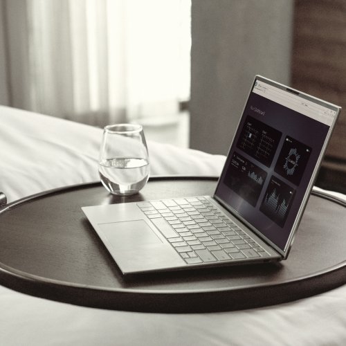
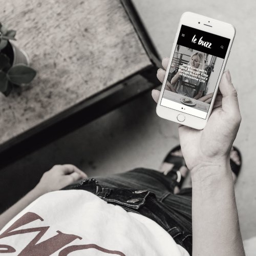
Final Designs
A walkthrough of the redesigned experience.
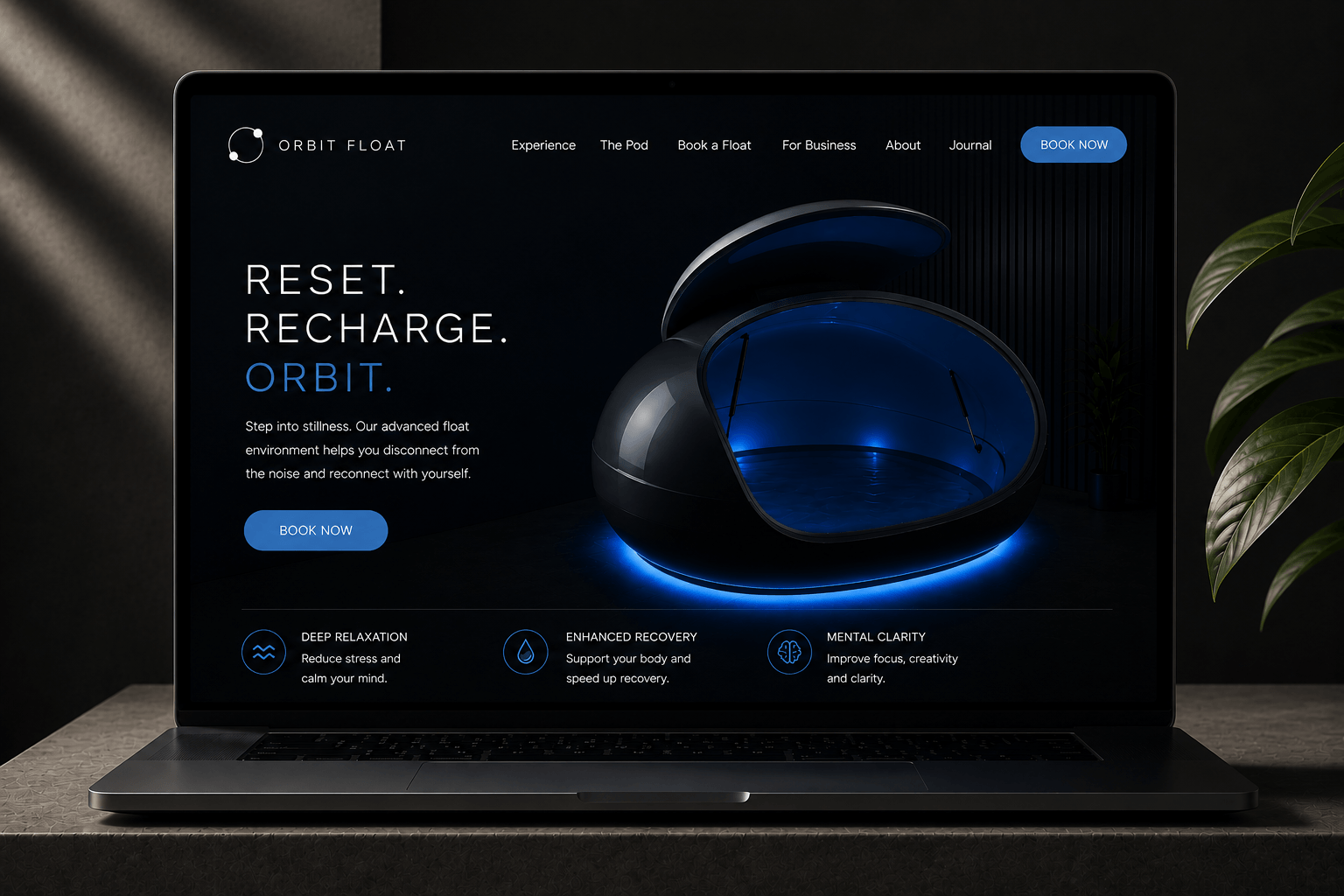
A homepage built around the experience
The new homepage leads with the sensory promise of floating — calmer typography, more confident space, and photography that conveys stillness rather than just product. Above-the-fold CTAs split cleanly between buy a pod and book a float without diluting either.
Product page engineered for high-ticket decisions
A redesigned product page that builds trust faster — clearer specs, prominent hygiene and filtration credentials, transparent pricing, and stronger social proof. Designed to close the deal for buyers who arrive ready and to convert hesitant ones with the right information at the right moment.
Dedicated booking flow for first-time floaters
A brand-new flow built specifically for users looking to try floating, separated from the pod-purchase funnel. Location finder, session selection, clear pricing, and a frictionless checkout — designed to convert curious visitors into booked sessions.
Accessible e-commerce checkout
A streamlined, WCAG-compliant checkout for both home buyers and B2B operators. Clear field labeling, visible focus states, accessible error handling, and a buyer-type split that routes B2B inquiries to a quote-based flow.
A refined brand applied everywhere
The evolved visual identity — new logo, refined palette, new typography, and consistent photography style — applied across every page, every component, and every interaction.
Design system documentation
The new design system documents every component, color token, type style, and accessibility specification — ensuring the brand stays consistent as the site grows.
Impact
Phased rollout with a clear focus on conversion and accessibility:
- Full WCAG 2.1 AA compliance across the new site
- Optimized pod sales funnel — sharper product page, smoother checkout, clearer pricing
- New booking funnel unlocked as a dedicated conversion path
- Refined premium positioning matching the quality of the product itself
- Foundation for scale — design system and accessible patterns ready to extend across future pages, campaigns, and product lines
Testimonial
"The first version got us off the ground. This version made us feel like the company we wanted to be — more premium, more polished, and open to every customer. Sales and bookings both feel stronger as a result."
Orbit Float
Founder
Review Score
What I Learned
Refining a brand is harder than building one
Starting from nothing gives you freedom. Evolving something that’s already in market means every change has to earn its place — and respect the equity already built. Restraint became the most valuable design tool of the project.
Accessibility makes everything better
Designing to WCAG 2.1 AA from day one didn’t just help users with disabilities — it sharpened the entire design. Better contrast, clearer hierarchy, more legible typography, and more intentional interactions benefited every user.
Two audiences need two journeys
The single biggest conversion unlock wasn’t a visual change — it was the structural decision to separate pod sales from float bookings. Honest information architecture beats clever design every time.
Future
Continued conversion optimization
With the new funnels live, the next phase is ongoing CRO — measuring real behavior, iterating on the highest-leverage touchpoints, and continuing to push both pod sales and booking conversion.
Content & SEO expansion
Long-form editorial content on floatation science, recovery, and wellness — designed to bring high-intent traffic into the new funnels.
Social and campaign extension
Extending the refined brand system into social channels, paid campaigns, and partnership materials to support broader awareness.
Ongoing accessibility audits
Treating accessibility as a continuous discipline — not a one-time milestone — through regular audits as the site evolves.
Closing
Orbit Float’s second phase was about refinement, not reinvention. In one month we evolved the brand, redesigned the site for both conversion and accessibility, and gave the business a foundation it can grow on without compromise.
Huge thanks again to the Orbit Float team for the continued trust and for treating accessibility as the standard it should be — not an afterthought.
Ready to launch a premium brand?
I help brands like Orbit Float build digital storefronts that win customers. Let’s chat.
Recent Posts
Recent Comments
No comments to show.
Popular Posts
Categories
Instafeed