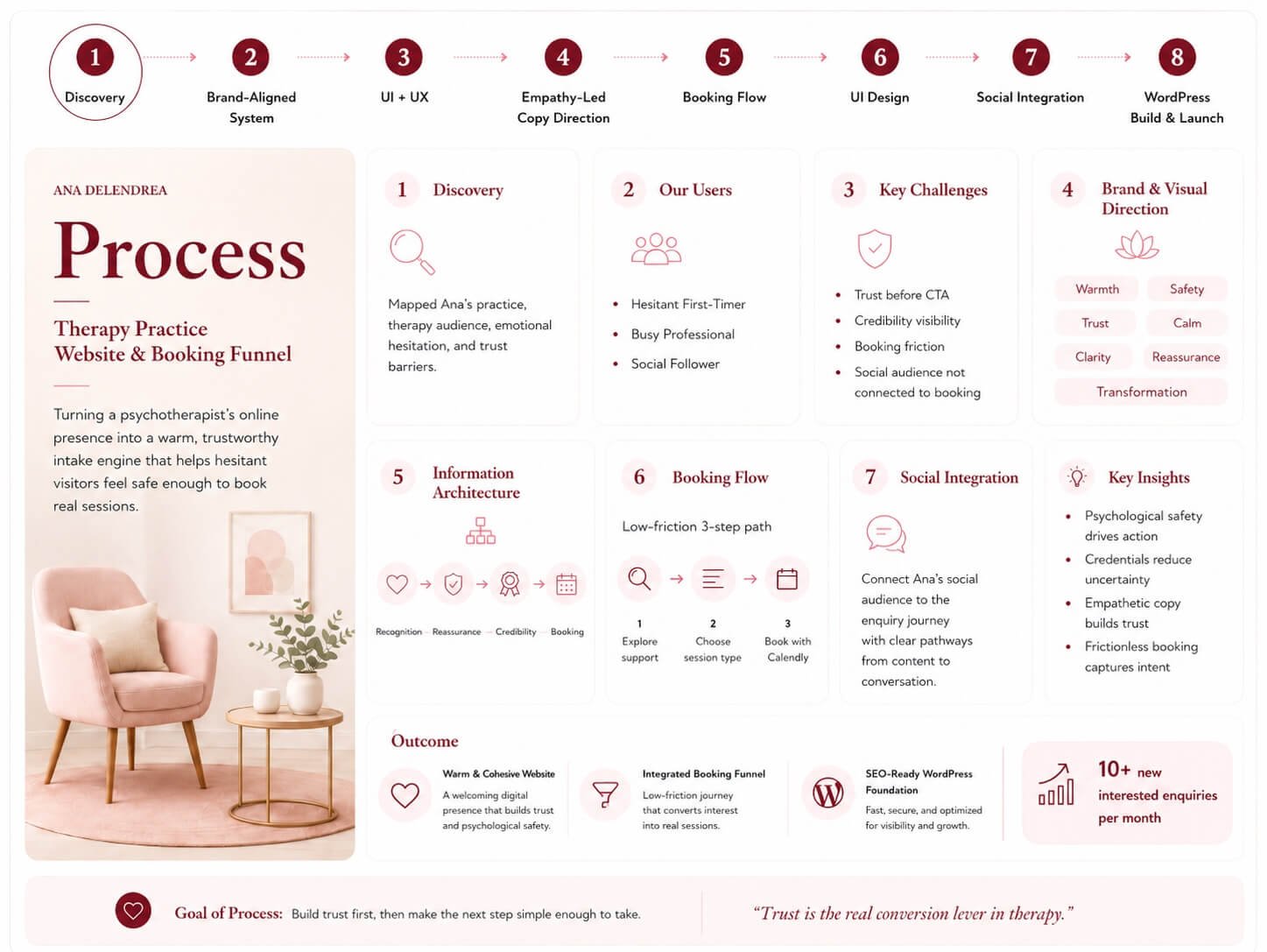
Turning a psychotherapist’s online presence into a warm, trustworthy intake engine that books real sessions.
New Enquiries 10+ interested clients/month
+ increase in social media engagement
🎯 Goal – Give Ana Delendrea, a Bucharest clinical psychologist, a website that does more than list services: one that earns the trust of emotionally hesitant visitors and converts them into booked therapy sessions, online or in-cabinet.
⚡ Challenge
OIn therapy, the visitor is often anxious, private, and unsure whether to reach out at all. The site had to lower that emotional barrier – feeling safe and human before ever asking for a booking – while signalling clinical credibility.
✨ Outcome
A warm, cohesive site with a frictionless booking flow and an integrated social-to-site widget that turned Ana’s audience into a steady stream of prospective clients – 10+ new enquiries every month.
The client only suggested burgundy as a color and both agreed on a reasonable site map. The rest is art.
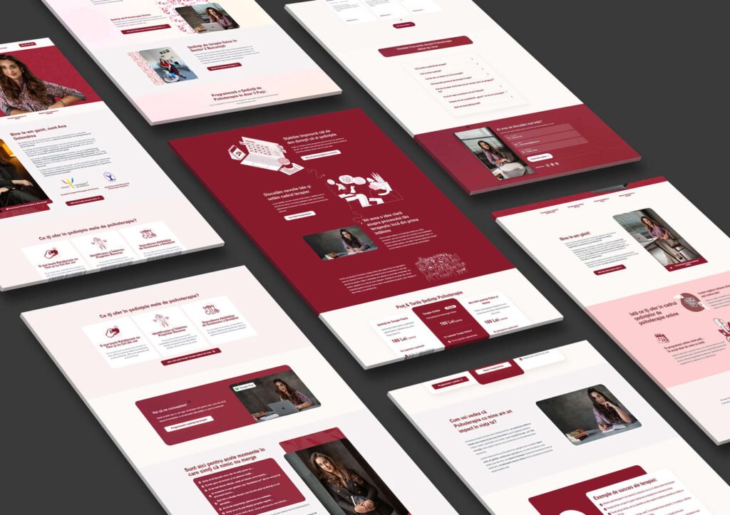
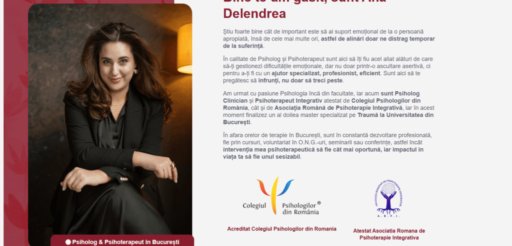
Ana Delendrea is a clinical psychologist and integrative psychotherapist practicing in Bucharest, accredited by the Romanian College of Psychologists (COPSI) and the Romanian Association for Integrative Psychotherapy (ARPI), currently completing a second master’s specialising in trauma. She offers therapy for adults and adolescents — anxiety, self-esteem, relationships, burnout — both online and in her Sector 2 cabinet. She had the credentials and the care; what she needed was a digital presence that conveyed both, and that turned quiet website visitors into booked first sessions.
I led the project end-to-end as designer and developer — brand-aligned visual design, UX strategy, page architecture, the booking funnel, and the WordPress build, from discovery through launch.
Discovery → Brand-Aligned Visual System → UX & Information Architecture → Conversion & Booking Flow → UI Design → WordPress Build → Social Integration → Launch
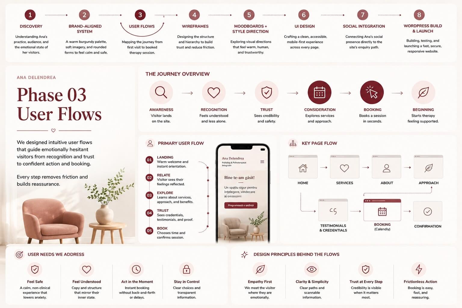
A hesitant audience needs reassurance before a CTA
People considering therapy are often anxious about the first step itself. A conventional “services and prices” layout asks for commitment before it earns trust.
Example: A first-time visitor unsure whether their struggles “count” can feel pushed away by clinical, transactional copy.
Impact: Visitors leave without reaching out, even when they need help.
In a field crowded with varying qualifications, a visitor needs fast proof that this is a legitimate, accredited professional.
Example: Without prominent accreditation, a cautious visitor can’t quickly tell a licensed clinician from an unqualified one.
Impact: Lost trust at the exact moment it matters most.
Even a motivated visitor drops off if booking means emailing back and forth or hunting for contact details.
Example: Someone ready to try a session on a Sunday night has no way to act in the moment.
Impact: Warm interest cools before it becomes a booked session.
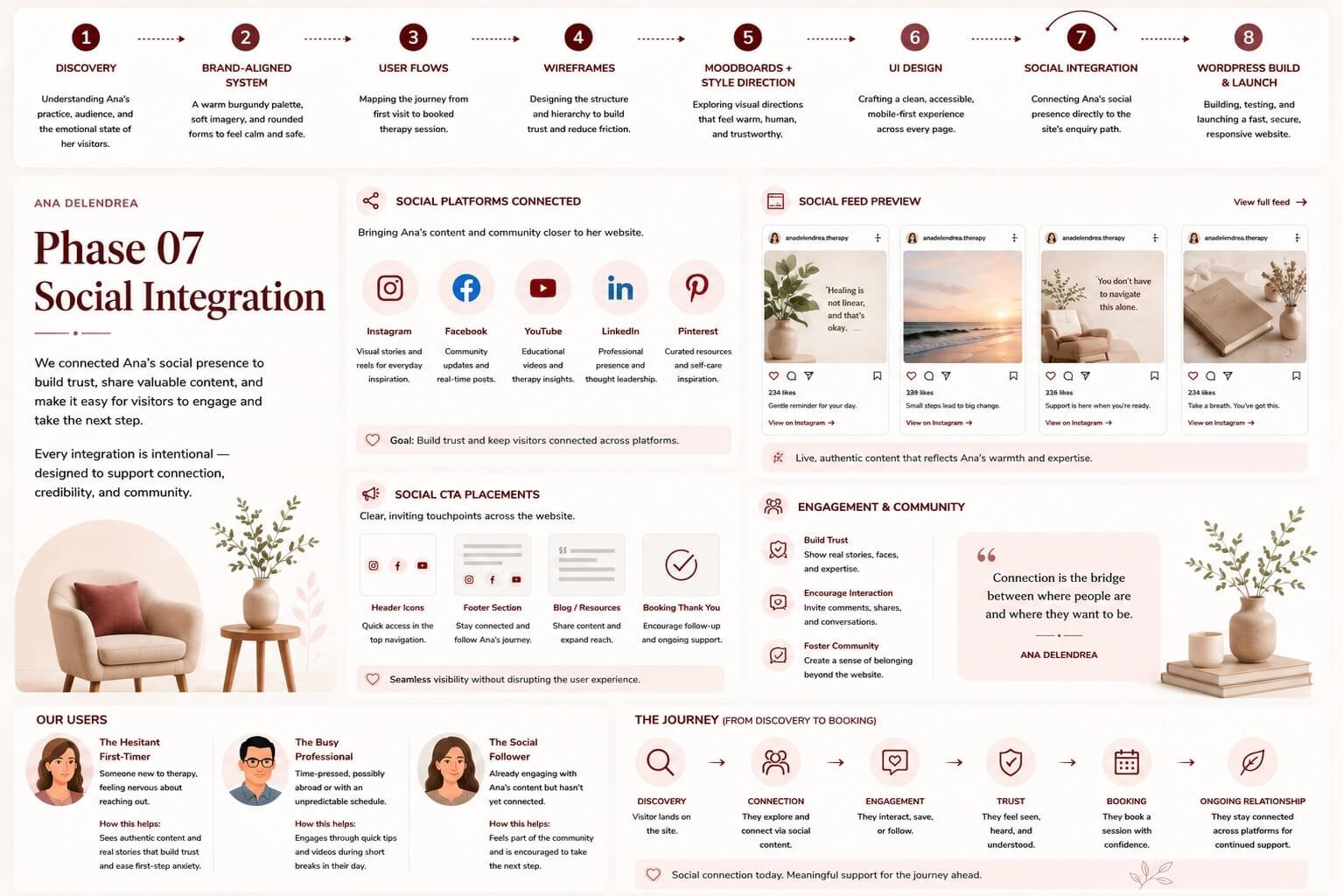
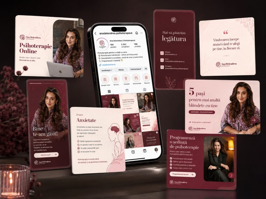
Ana was active and engaging on social media, but that audience had no direct, low-pressure route from “following her” to “booking with her.”
Example: An Instagram follower reading her content had no in-site nudge connecting that interest to an enquiry.
Impact: Engaged followers stayed followers instead of becoming clients.
The site didn’t need to sell harder — it needed to feel safer. The real design challenge was psychological: build trust and remove friction so a hesitant person feels able to take the first step.
A clear, low-pressure path from visitor to scheduled appointment.
Connect Ana’s social presence directly into the site’s enquiry path.
Surface accreditation and qualifications up front.
The Hesitant First-Timer – Someone who senses something is wrong but has never been to therapy and feels nervous about reaching out.
Jobs-to-be-done: When I’m struggling but unsure, I want to feel understood and safe, so I can take the first step without fear of judgement.
The Busy Professional — Time-pressed, possibly abroad or with an unpredictable schedule, weighing whether therapy fits their life.
Jobs-to-be-done: When my schedule is full, I want flexible online sessions I can book around my life, so distance and time aren’t barriers.
The Social Follower — Already engaging with Ana’s content, warm to her, but hasn’t yet connected following with booking.
Jobs-to-be-done: When her content resonates with me, I want an easy path to actually work with her, so my interest can become action.
Understanding Ana’s practice, audience, and the emotional state of her visitors.
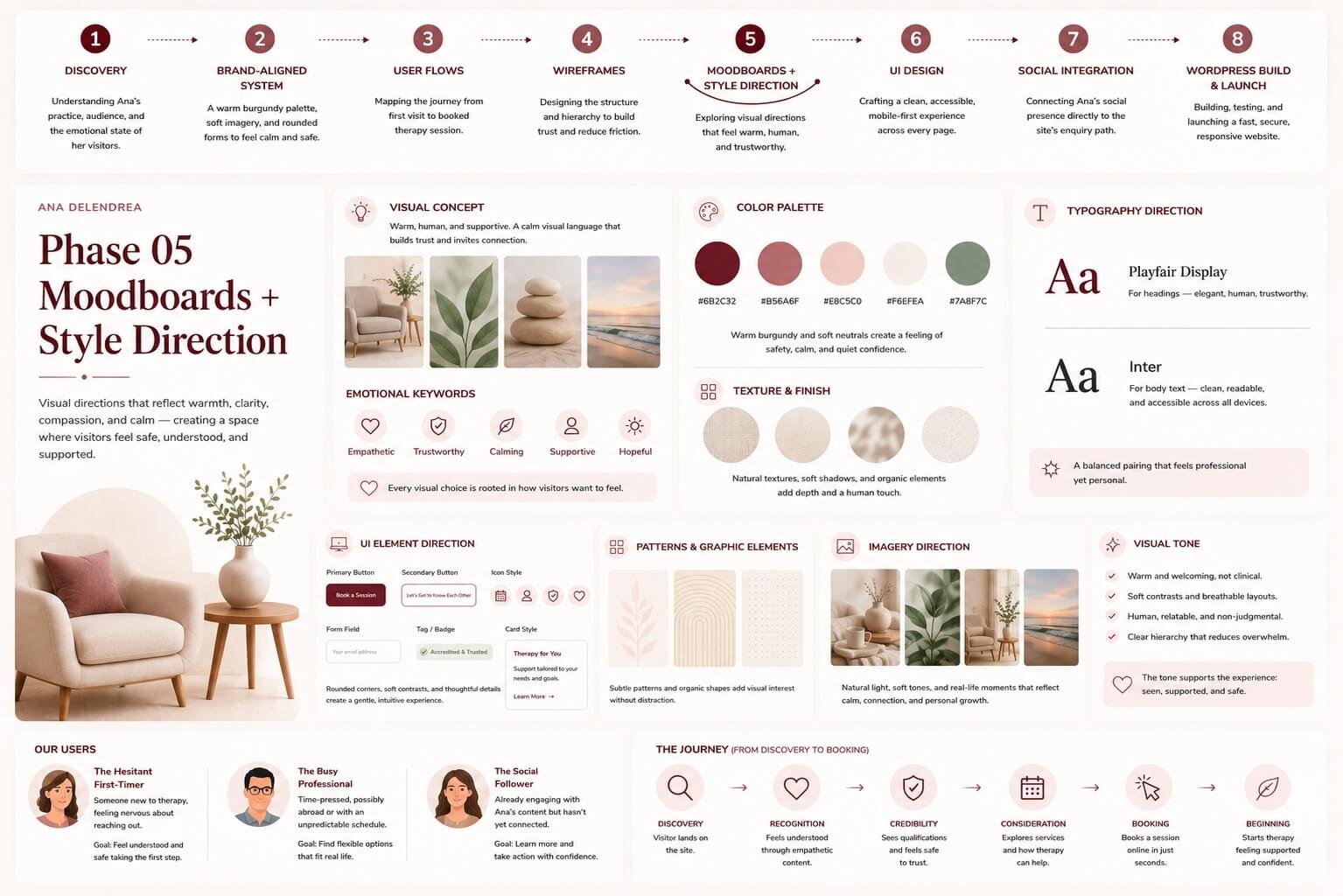
A warm burgundy palette, soft imagery, and rounded forms to feel calm and safe.
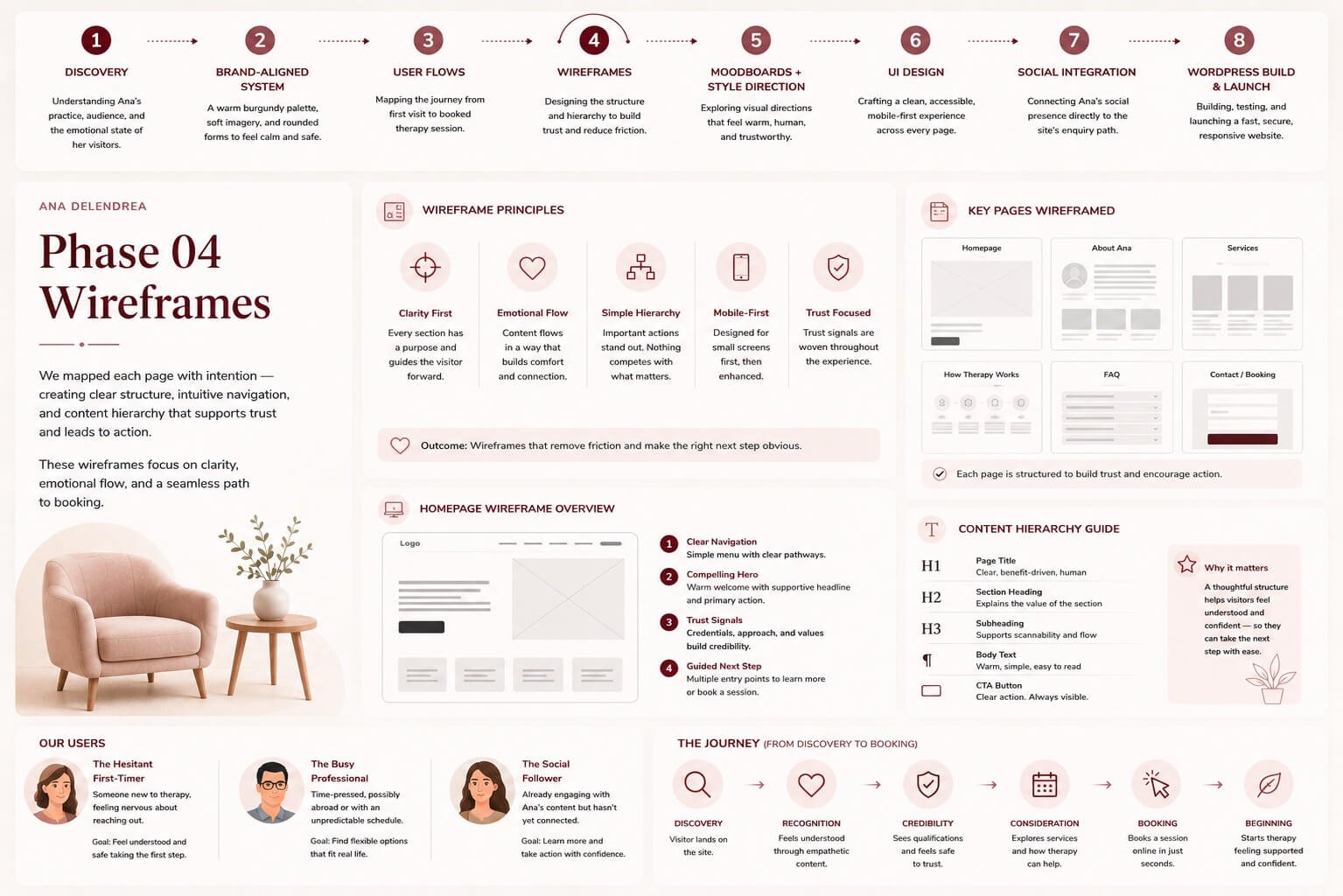
Structuring the journey: recognition → reassurance → credibility → booking.
Language mirroring the visitor’s feelings (“you feel something’s missing…”).
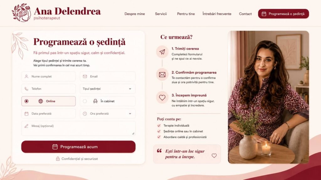
Integrating the Calendly scheduling widget for in-the-moment booking.
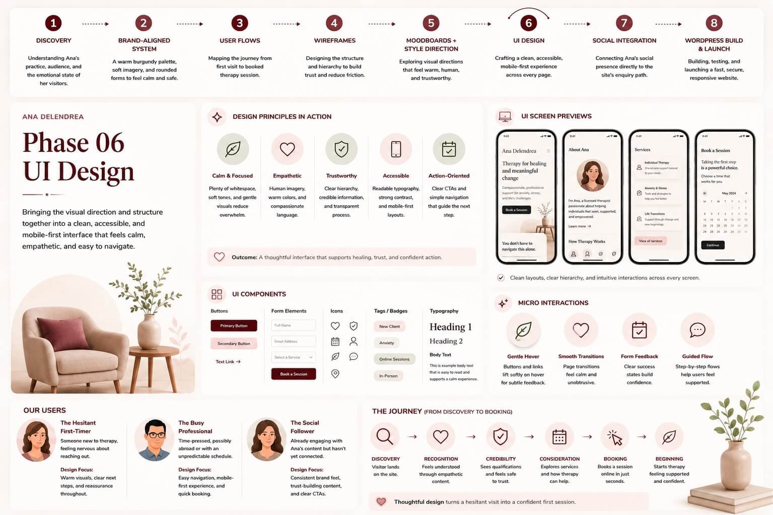
Mobile-first, accessible, cohesive across every page.
Social Integration — The [widget name] connecting social presence to the site’s enquiry path.
Building and shipping the live, responsive site.
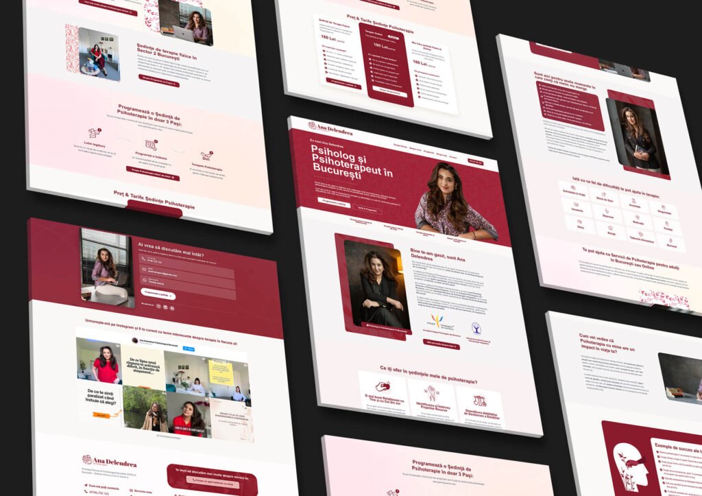
A walkthrough of the launched experience.
“Bine te-am găsit” (“I’m glad you found me”) and a clear path to book.
COPSI and ARPI accreditation surfaced high on the page.
the “moments when nothing feels right” section that earns the scroll through recognition.
“we talk → you schedule → we begin,” with a low-pressure “let’s just get to know each other” entry point.
Three clear options at one honest price, with Calendly booking on the spot.
Phased launch with measurable lifts in the first months after going live.
In therapy, the barrier isn’t visual – it’s emotional. Designing for psychological safety did more for bookings than any persuasion tactic could.
Copy that reflects the visitor’s inner state earns the right to ask for action.
The biggest unlock wasn’t on the page – it was bridging Ana’s social audience to her booking path.
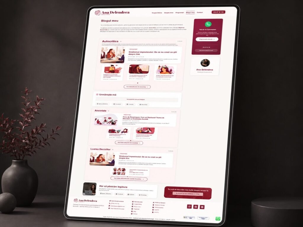
Expanding the blog to bring high-intent visitors into the booking funnel.
Iterating on the booking flow against real behaviour.
Extending the system into Ana’s social and outreach.
Ana Delendrea’s site proves that in a sensitive field, design’s job is to make people feel safe enough to act. By pairing warmth with credibility and removing friction from booking, the site turned a static profile into a practice that books real clients – and connected an engaged social audience to a steady stream of new enquiries.
Ready to turn your presence into bookings? Let’s chat.